Challenge
Evolve Mimir's design strategy to enable the business to support multiple products servicing distinctive markets.
Role
Conduct user research, build a design strategy, code the UI component library, and document everything.
Mimir was preparing to introduce a new product aimed at a new audience, Mimir Workforce. We wanted to build a consistent design system to enable all team members (engineering, marketing, customer support, and sales) to support multiple products. As the lead designer, I was responsible for determining why we needed a design system, what we wanted to build, and how we would execute. The major components of the design system we needed were:
UI Component Library
Before this initiative, UI components were designed on an as-needed basis without thought for reuse and consistency. The lack of standards led to many different variations of the same components thereby confusing users. With work starting on a new product, we realized the need to build an atomic component library to bring consistency to both products.
Product Branding
Prior to the introduction of Mimir Workforce, our company had just a single product called Mimir Classroom. The terms "Mimir" and "Mimir Classroom" were synonymous to our users. To ensure a maintainable brand system for the future I worked to create a branded house, separating Mimir from both Mimir Classroom and Mimir Workforce.
Guidelines & Documentation
Prior to this, the company had never invested much time into design documentation and the accessibility of such documentation. My primary goal was to provide my coworkers with resources so that they felt empowered rather than restricted by the design system.
UI Component Library
The inconsistencies of our UI components was felt across the company but was never objectively documented. It was the elephant in the room that no one wanted to talk about or acknowledge.
Conducting a Design Audit
Inspired by the depth-first searching algorithm I learned while studying Computer Science, I designed a similar process for auditing our products. Beginning with the root page, I compiled a page queue and manually identified all of the UI components on each page. For each component I would document the following:
- Instance Name (e.g. blue button, number input, or large header)
- Component Type (e.g. button, input, or header)
- A link to the page
- A screenshot URL (Pro-tip: Dropbox will automatically upload and copy the share link to your clipboard when you screenshot on a Mac)
- Steps to reproduce (i.e. how to make the component appear if it's not initially shown on the page)
If the component had an action that navigated to a new page I would add the new page to the page queue. Within this queue, each page had the following:
- Page name (e.g. Dashboard or Account Settings)
- Status (Visited, In Progress, or Not Visited)
- A link to the page
When I finished documenting all of the components on a page, I would return to the list of pages, mark that page as "Visited" and begin documenting the next page in the queue.
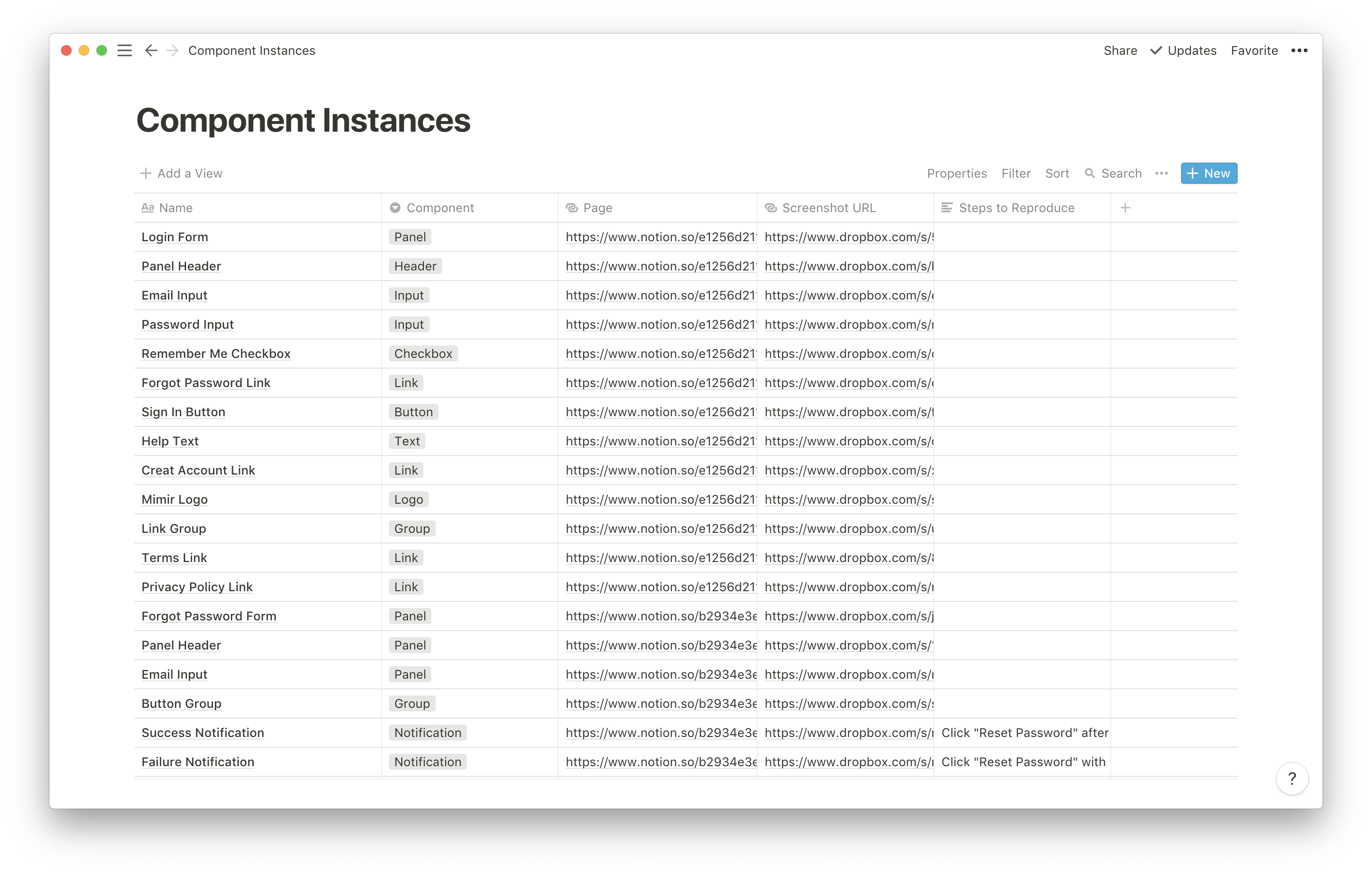
879 component instances were documented.
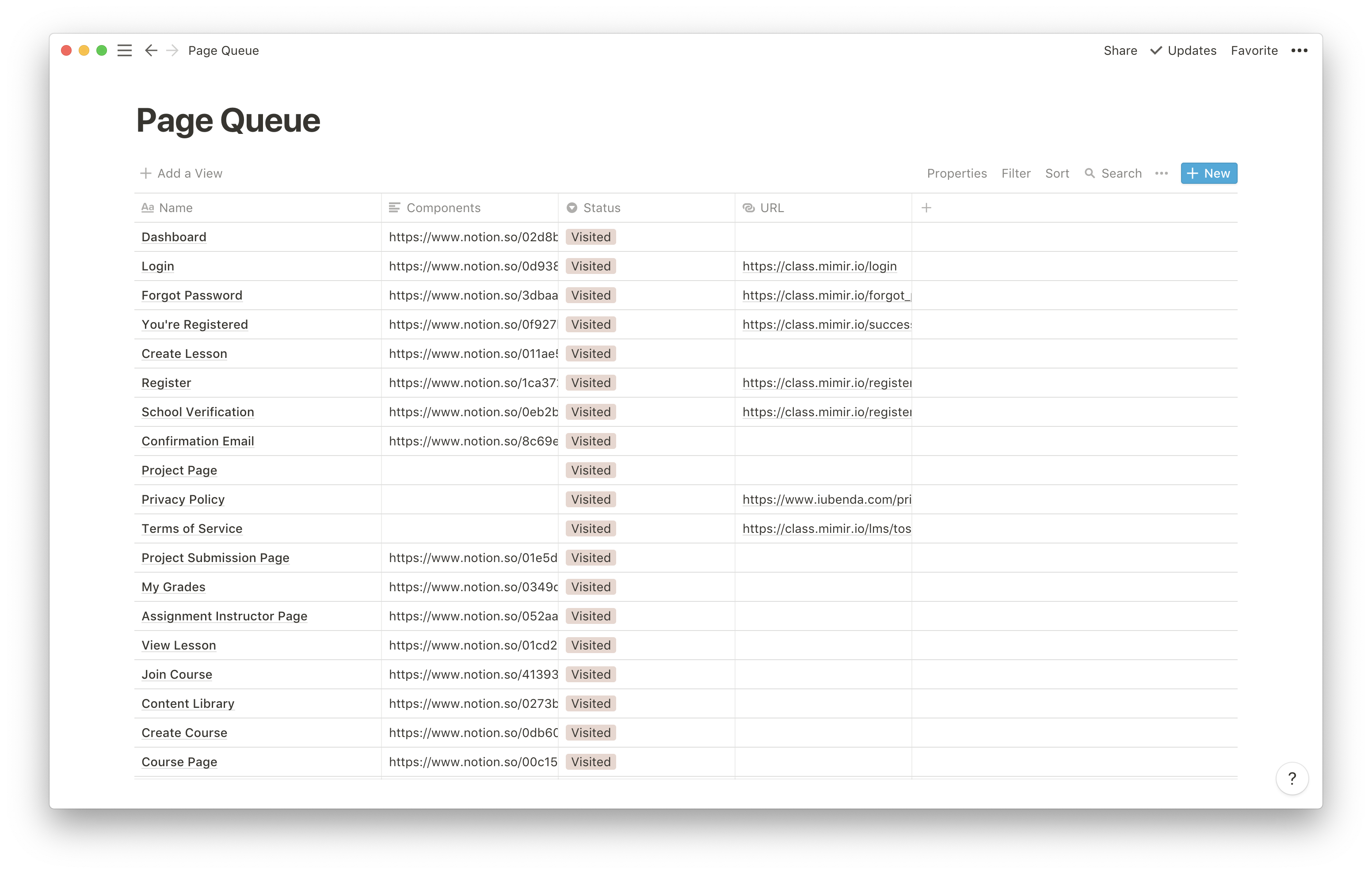
35 unique pages were parsed.
Design Audit Outcomes
The Design Audit empowered our team with information that made it simple to answer the following questions:
- How many inputs are in our product and what do they all look like?
- What are all of the components in use by our product?
- How many different variations of buttons do we have and how many different variations of buttons do we need?
- What are all of the pages in our product? (Due to how Mimir Classroom evolved, this was very hard to answer before the Design Audit.)
- When are we using toggle switches and when are we using checkboxes?
The Design Audit also gave us tangible metrics on the UI components used in our products. For example we had:
- 16 different styles of buttons
- 3 different styles of dropdown menus
- 3 different styles of breadcrumbs
- Only 1 style of toggles
- 2 different styles of accordions
- 9 different styles of headers and labels
- 4 different types of in-app notifications
- 6 different styles of tags
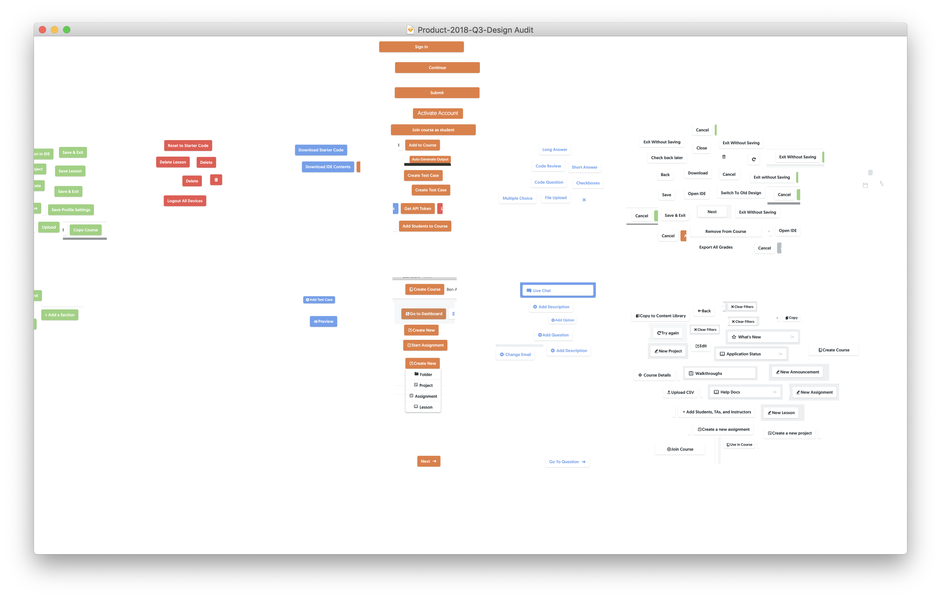
16 different styles of buttons.
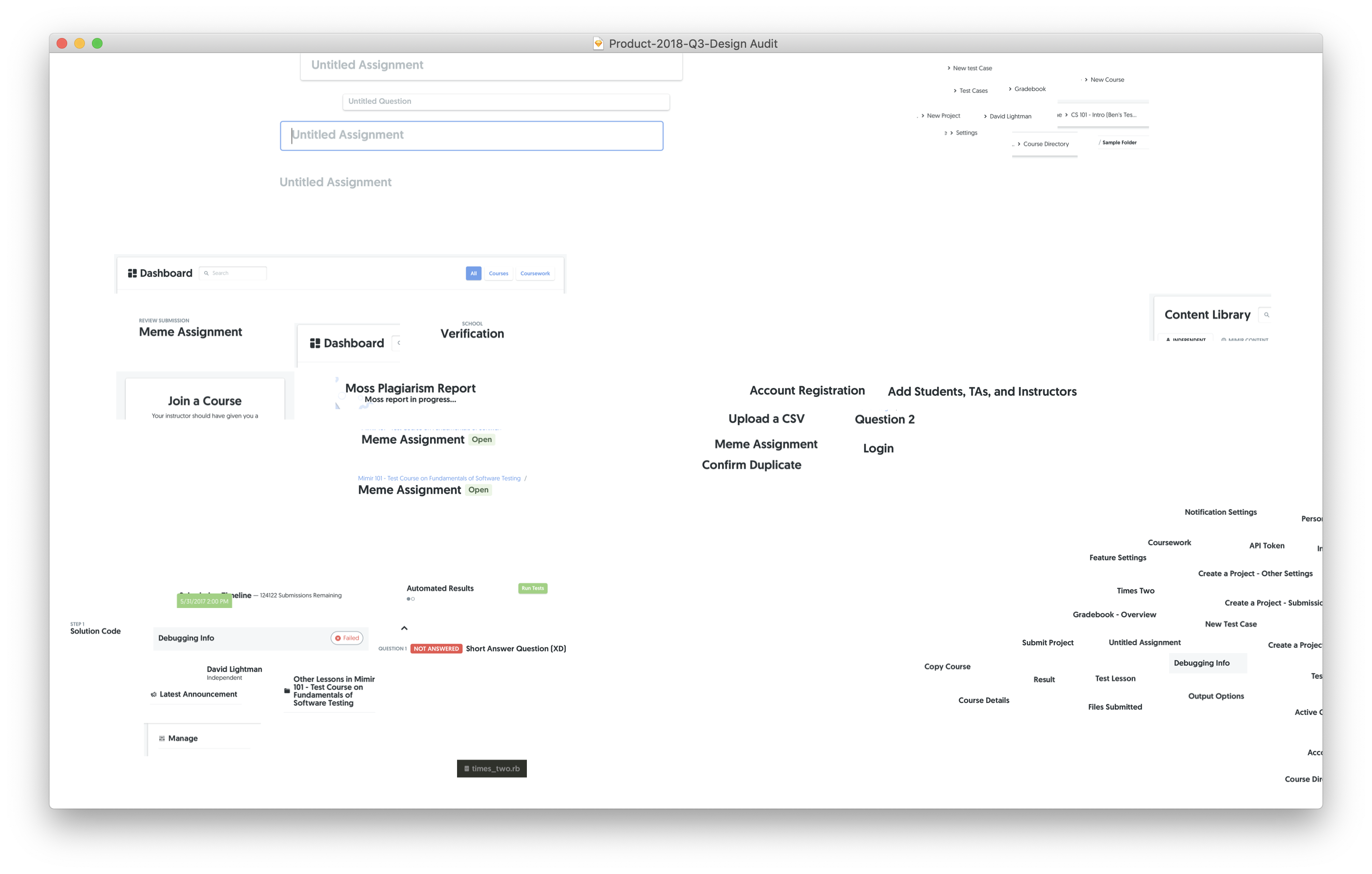
9 different styles of headers.
A single atomic component could be used in different contexts and should behave in way that best accommodates its use case. So the goal became to make atomic components consistent within similar use cases rather than purely minimizing the number of different styles.
I analyzed each component and documented all of the different use cases the component was trying to accommodate across our products. For example buttons were used for navigation, dropdown menus, modal triggers, copying text, revealing components, and more. Headers were used to label pages, sections, or components. Inputs were used for form fields or searching. I even learned we were using both toggles and checkboxes interchangeably to accomplish the same task.
Redesigning UI components
Before I redesigned any components I experimented with an 8px grid system. This meant that every component's sizing, spacing, and layout would adhere to a multiple of 8 pixels (e.g. 8, 16, 24, 32, 48, 64, etc).
When I revisited the design of each component, I had in front of me all of the different use cases it needed to solve. This way I was able to design each component so that our users could better predict a component's action based on its style. After all, the goal of the UI component library was to reduce the confusion of our users.
Branding a Product Suite
When tasked with implementing a new brand system I had a few challenges:
- Maintain the brand we've built with our current users
- Reflect the broader company vision
- Allow the brand to extend to new products in the future
While researching how different companies manage their brands I learned of the two most common approaches: a branded house and a house of brands. A branded house means that each product offering is tied to the overall brand, creating a cohesive suite of products. A house of brands means that each product is given its own identity to operate independently from the overall company. By talking with our founders we decided on building a branded house because we wanted to build Mimir's reputation across the software engineering industry.
We identified three definite brands to formalize: Mimir, Mimir Classroom, and Mimir Workforce. We already had a strong logo and an association between the color orange and Mimir Classroom. We wanted to keep that in order to retain the identity of the product. This led us to create a branding system based on colors. Orange for Mimir Classroom, purple for Mimir Workforce, and a neutral gray for Mimir. Each brand was labeled with a colored version of the same logo along with the name. This meant that adding a new product or service only required a differentiating color and a single word name (e.g. the color teal and Mimir Academy).
Guidelines & Documentation
Mimir used Notion for all internal documentation, notes, and communication. I wanted the brand guidelines to be easily accessible to any employee, so I decided to simply host them in Notion. These guidelines laid out how to properly use logos, brand graphics, colors, typography, and icons. It also hosted all of the relevant assets an employee might need including logo variations (PNG, EPS, SVG), fonts with appropriate licensing, icon assets, color swatches, and more.
For documenting the UI component library, I began by talking with our engineers, who would be the target users of the library. What they wanted the most was instruction on how to choose between different components and variations along with detailed implementation details. With this in mind I set out looking for inspirational examples of component documentation. I found the Evergreen UI Framework made by Segment and showed it to our engineers. They agreed that it did a great job of accommodating all of their use cases so I began building our own documentation system inspired by Evergreen.
In order to prevent the documentation from getting outdated I decided to build it directly on top of our component library. This meant that the documentation would always reflect the most up-to-date version of our components with minor maintenance. I also chose to use to use MDX (https://mdxjs.com) so that it's easier for designers and developers to update the documentation with Markdown. I also used React Live (https://github.com/FormidableLabs/react-live) so that we could have editable components within the documentation. This means that our engineers were able to discover which components they should use based on use case and learn how to implement that component instance all within our UI component library documentation.
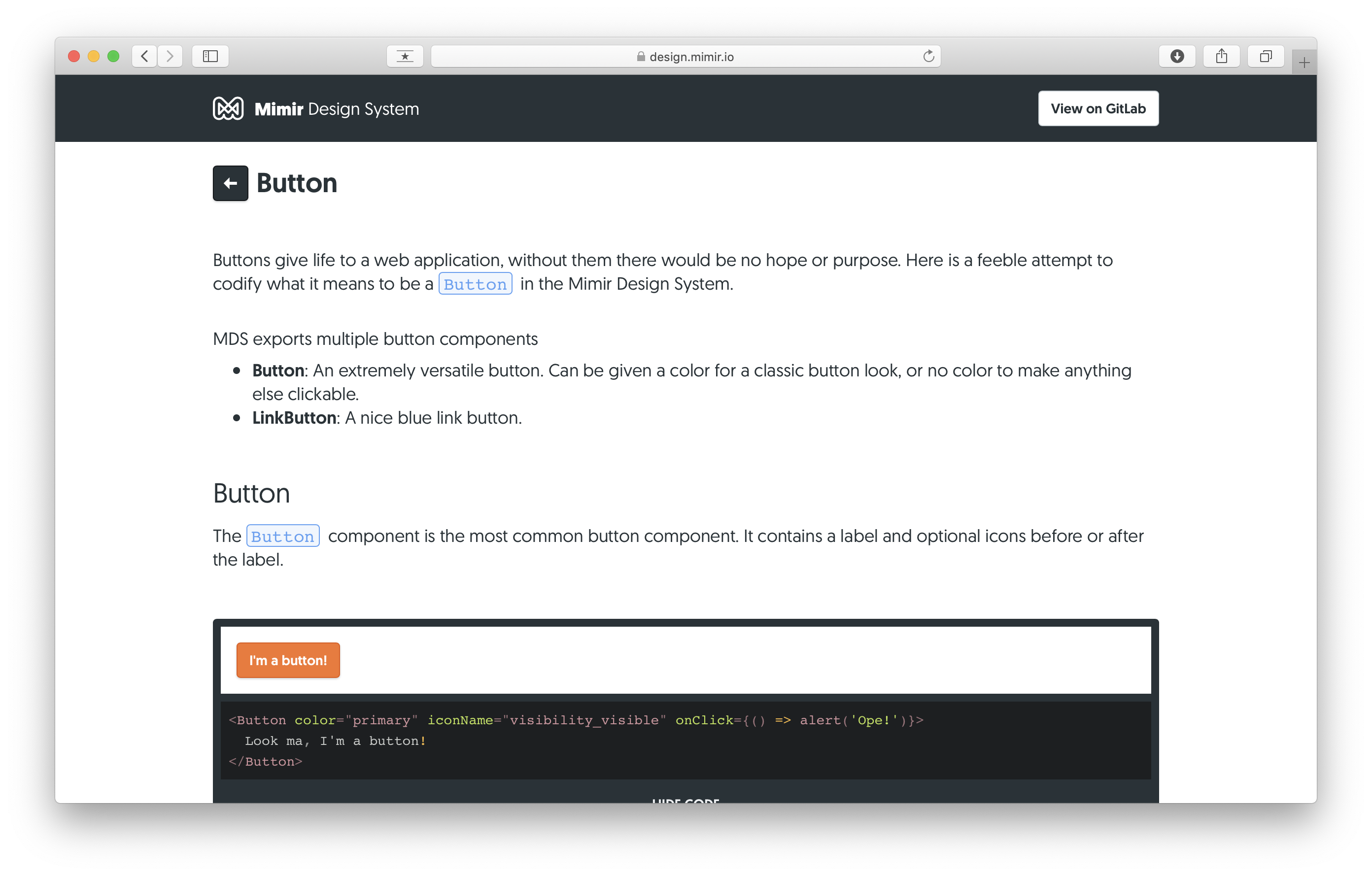
An early draft of the documentation page for Buttons
Learnings
Start with a design audit.
By starting with a design audit I was able to advocate for design consistency in a way I was never able to before. In the past I had brought up the fact that much of our UI was inconsistent and my fears that it hindered usability but I had no evidence to support my claim. After the design audit it became immediately clear how inconsistent our products were and built support for design consistency as an initiative across the company.
The design audit gave us crucial insight into the use cases for different components. I was able to measure the effectiveness of a design against a use case rather than creating arbitrary sets of rules hoping they will work with different uses. The design audit also helped us identify many components that were wrongly used (e.g. toggles and checkboxes).
Don't underestimate the cognitive load of visual changes.
After we finished the updates to the UI components we decided to release them to our users. Mimir Classroom services classes that run on a semesterly system. We felt comfortable releasing these changes in the middle of a semester because we hadn't changes any workflows or major interactions. While the reaction to the redesigned components was mostly positive, many users attributed the changes to unrelated bugs and issues with our products. Some customers expressed frustration that we had changed the product in the middle of their semester.
Our initial assumptions about the effect of these changes were incorrect. Even though we didn't change any workflows or major interactions, the visual changes to components were widespread enough to confuse users or at least concern them that more major changes could have been made. We set in place a system for determining how to release changes in the future based on the severity and magnitude of the changes. Severity meaning how quickly we need to release the changes and magnitude meaning how large will the effect of the changes be on our users current understanding of the product.